Login
Login
Worst movie posters ever
Sort by:
Showing 42 items
Decade:
Rating:
List Type:
 350
350
") 6.2
6.2
 6.2
6.2
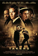
Takers (2010)
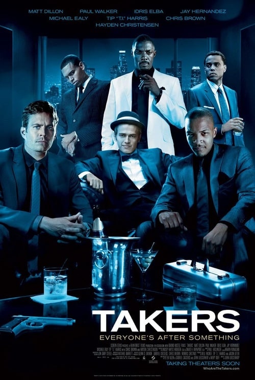
Comment : This poster is nowadays considered as The Worst Movie Poster ever. It’s all wrong. There are just so many badly photoshopped heads in one poster it may well be a record. T.I.’s head is far too big for his body, as is Paul Walker’s, and Hayden may well have lost his neck in a firefight somewhere. As for Michael Ealy on the right, he’s definitely not really in that room, and he’s definitely not holding that drink. And what’s up with Chris Brown’s hands, anyway?
johanlefourbe's rating:

 704
5.3
5.5
704
5.3
5.5
The Whole Ten Yards (2004)
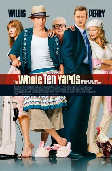
Comment : with Bruce's face (and his worryingly feminine legs), Matthew's face (who is looking at what, exactly?), their heights, perspective in general, and worst of all, Kevin Pollak's hands and face. It looks like he's had his fingers superglued onto the two stars and was then promptly sedated.
Other terrible poster :

johanlefourbe's rating:

 366
5.1
5.6
366
5.1
5.6
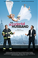
The Accidental Husband (2008)
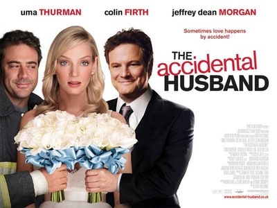
Comment : Jeffrey is looking very creepily at Uma’s hair – it’s great hair, but stop it now. As for Colin Firth, he’s so in love, he’s looking through his love interest. Then there are the two male leads’ forearms, which are officially, um, wrong… not to mention the flowers, which are so perfectly the same that you can’t help but think: “Now there’s some bad Photoshop.” And if Colin’s arm is as close to his chest as it looks like it is, that makes Uma… about 1mm wide.
Other terrible posters :
johanlefourbe's rating:
 511
4.7
4.8
511
4.7
4.8
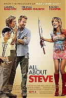
All About Steve (2009)
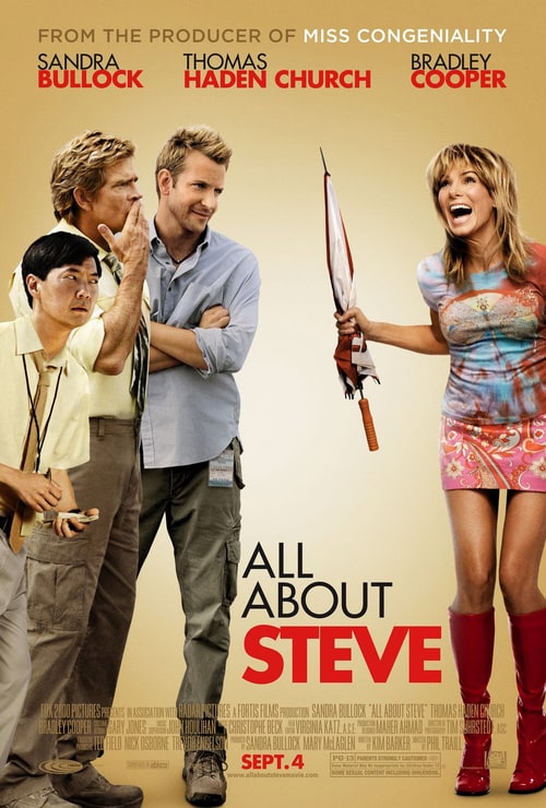
Comment : Who is looking at where is looking at who exactly? There’s no one place that the eye is drawn to (apart from maybe the multi-coloured vomitorium that is Sandra Bullock’s top) so you immediately think “What is everyone staring at?” If there was ever a poster that screamed “We just cobbled this together, but who the hell cares, it’s a turkey”, it’s this one.
johanlefourbe's rating:
 719
6.7
6.6
719
6.7
6.6

Comment : Is that an absurdly large gun in your hand, or has someone just ruined a perfectly decent poster? Ah, the latter; it all makes sense now. Then, of course, there’s the delightful Ms. Mendes, rendered startlingly non-delightful by the Photoshop makeover she’s endured, where she’s hoisting up her dress and revealing some cartoonish cleavage.
johanlefourbe's rating:

 474
5
5.3
474
5
5.3
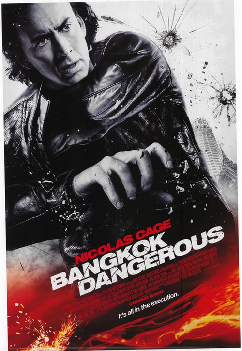
Comment : Where to begin? The lava lapping around his waist, the glass that’s somehow in front of the poster, the incredibly ironic tagline, the fact that he’s looking for his shoulder-holstered gun inside his shoulder, or that he doesn’t actually have a gun in his hand. That’s right, no gun. Where are those bullet holes from? An invisible assailant? Point anywhere on the poster and there’s something wrong. Sad, but true.
johanlefourbe's rating:
 58
3.4
2.8
58
3.4
2.8
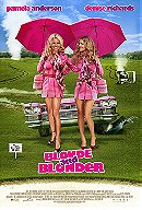
Blonde and Blonder (2008)
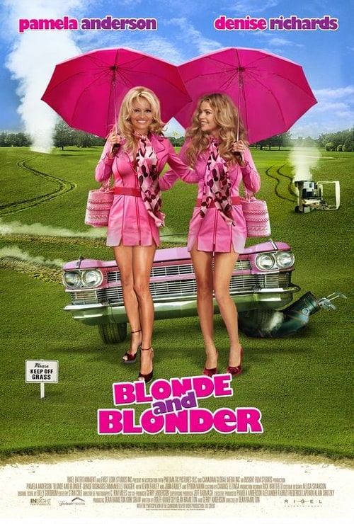
Comment : Everything. Seriously, everything. The grass, the shadows (seriously, the shadows), the keep off the grass sign, the appallingly crap tyre tracks, the golf buggy rotated 90 degrees (and boiling a kettle while it’s at it), the stuck-on heads, Denise’s deranged face, Pamela’s left knee, the screeching tyre on the golf bag, the unexplained geyser in the middle-distance…
Other terrible poster :
 74
5.1
5.5
74
5.1
5.5
Crazy on the Outside (2010)
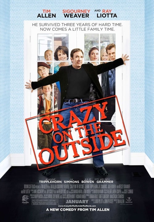
Comment : Leaving the extended family behind the door for a moment, is it just us or is Tim Allen’s chest very flat these days? Also, isn’t Ray Liotta’s head meant to be attached to his neck, not his shoulder? Is his leg cocked like that for a reason? Is he knee-ing the door? And why is Sigourney so obsessed with that particular piece of wood? Doesn’t J.K. Simmons look a bit embarrassed about the whole affair?
johanlefourbe's rating:
 585
6.7
7.1
585
6.7
7.1
Everybody's Fine (2009)
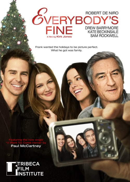
Comment : Sam and Drew look perfectly believable, jolly, lifelike. Just the kind of thing you’d want on a movie poster, in fact. Kate Beckinsale, though absurdly pretty, looks away into the far left for no real reason, and as for Robert De Niro… is that even really Robert De Niro? He’s so whitewashed and scrubbed he’s barely recognisable. And as for that hand / camera combo, is that meant to be Robert’s hand? If so, is that physically possible? And the tree… well, the tree is just crap. That’s final.
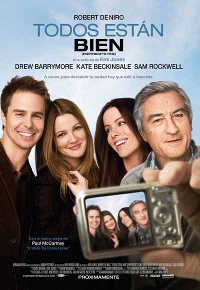
Other terrible poster :
johanlefourbe's rating:

 910
5.5
5.6
910
5.5
5.6
Good Luck Chuck (2007)
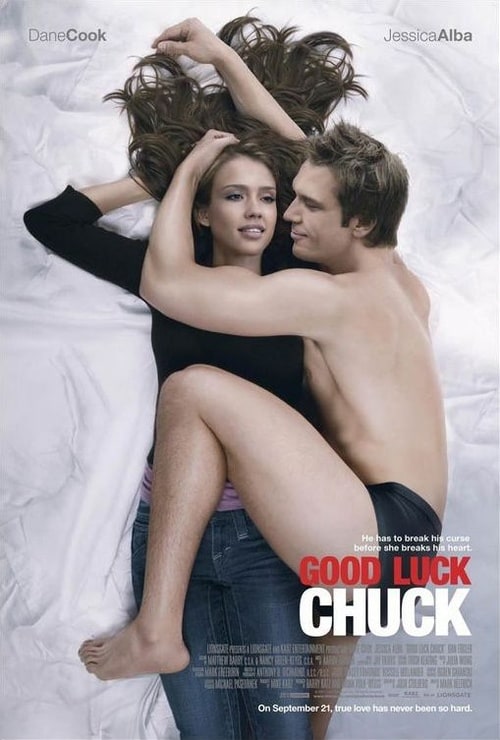
Comment : This poster is so bad, so creepy, so disturbing, so unforgivably wrong, we truly cannot understand who in their right mind rubber stamped this: “Yes, we love it. Plaster it all over the country’s billboards. The nation must see Dane Cook’s sinister face, and quickly!” File this one under ‘disaster zone’.
Other terrible poster :
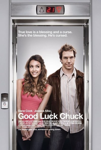
johanlefourbe's rating:
 210
5.4
5.9
210
5.4
5.9
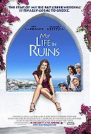
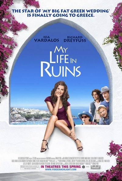
My Life in Ruins (2009)
Comment : There’s the ‘who or what is everyone looking at and why’ conundrum that almost every badly Photoshopped poster suffers from, but then there’s the legs, which seem dislocated and absurdly faked, as well as the shadows on the wall, which make no sense at all, and the almost sweet attempt at a heart in the clouds. Also, how tall is that lady in the hat? And how short is Richard Dreyfuss these days?
Other terrible posters :
 20
5.4
4.5
20
5.4
4.5
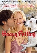
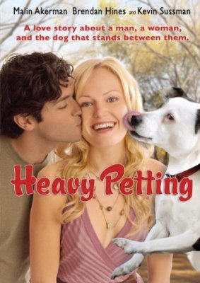
Heavy Petting (2007)
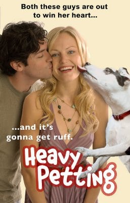
Comment : As if the picture of an immensely smiley Malin Akerman being licked by a dog weren’t enough, they had to badly Photoshop an immensely smiley Malin Akerman being licked by a dog. Is that dog mid-jump? What’s it leaping off? Isn’t it worryingly massive in comparison to the human stars of the show? And as for the title font, that could well have been done on Paint.
Other terrible poster :
 606
4.6
4.7
606
4.6
4.7
Jonah Hex (2010)
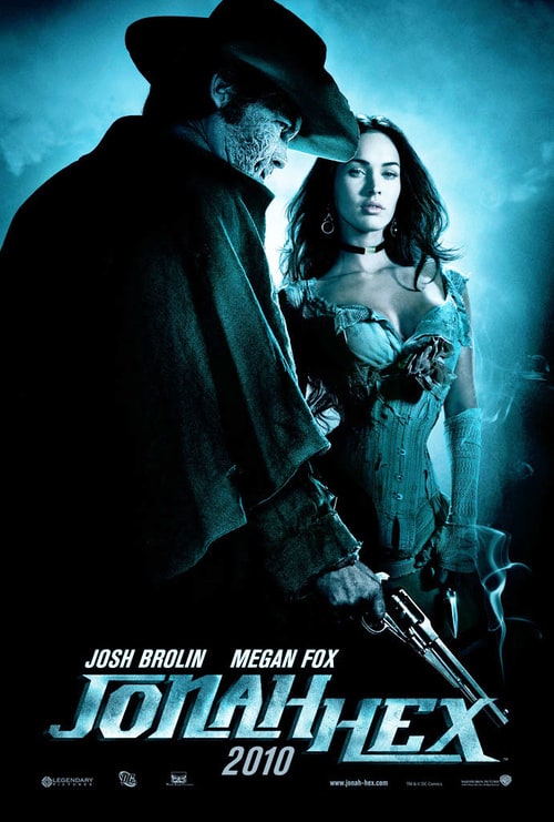
Comment : At first glance, this poster looks fine. Atmospheric, moody, all that jazz. But then you notice a few things that are a bit askew (and we’re not talking about Jonah’s scarred face) – though Megan is wearing a corset here, shouldn’t she have a few more ribs than that? And why does Jonah have tiny, T-Rex arms? With those limbs, he’d barely be able to get anything out of his holster, let alone take anything out of his trouser pockets.
johanlefourbe's rating:
 2014
6.1
6.3
2014
6.1
6.3
King Arthur (2004)
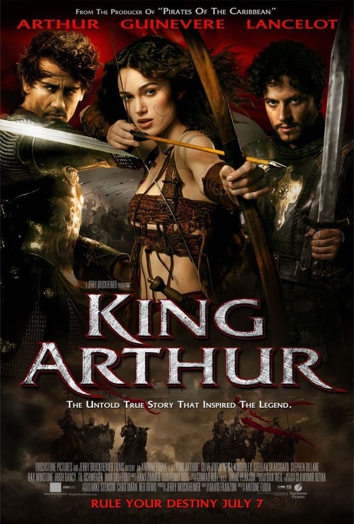
Comment : Altogether, the most you can say about this poster is that it’s boring, failing to bring about those epic expectations the movie really wanted, instead giving you the feeling this could well be a straight to DVD number.
johanlefourbe's rating:
 289
5.6
5.8
289
5.6
5.8
Mad Money (2008)
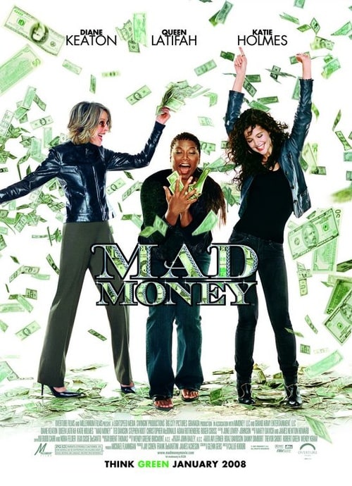
Comment : Who are you and what have you done with Diane Keaton’s head? There seems to be no logical reason why she’s turned that way to do the Egyptian while greenbacks rain from the sky, but there she is, her head too big for her body, her left leg turned at an angle just… because. Why is she looking at Katie Holmes instead of the money? Why is her right hand not shown? Our thoughts: a gun. Or maybe even more money.
johanlefourbe's rating:
 487
5.4
5.8
487
5.4
5.8
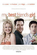
My Best Friend's Girl (2008)

Comment : Dane Cook himself wrote a blog about how bad this poster is !
Here are his thoughts :
'Here are a few things that truly blow about my upcoming movie poster to promote the release of the film opening on September 19th:
1. Graphics:
Whoever photoshopped our poster must have done so at taser point with
3 minutes to fulfill their hostage takers deranged obligations. They should have called Donnie Hoyle and had him give a tutorial using "You Suck at Photoshop" templates. This is so glossy it makes Entertainment Weekly look wooden.
2. My head:
The left side of my face seems to be melting off of my skull. I guess I am looking directly into the Ark of the Covenant? Are they going for the bells palsy thing here? My left side looks like Britney Spears' vagina.
3. The Stare.
My character apparently has fallen in love with a strand of Kate Hudsons hair. Kate's mannequin is desperately in love with the inside of my right ear while Jason is half stunned, half corsage.
4. Lips:
It looks like I'm wearing Maybelline Water Shine Diamonds Liquid Lipstick. My characters name is now Winter Solstice and I'm a hooker with a heart of gold. Jason is my floral carrying pimp, while Kate is my first trick!
5. Fashion:
My character is sporting a very high collar. I mean damn they should be snow capped at that altitude. It's going for the vampire lurking in the castle basement vibe. An Olympic pole vaulter would have a tough go clearing that collar. I'm also able to turn my head comfortably 360 degrees, because I was raised in an abandoned barn by a family of owls.
6. Flesh:
It's no secret that I'm more rugged facially due to a drunken visit by the teen acne fairy, but according to this poster I've got perfect porcelain flesh. I look like the fuckin' bathroom floor at Caesars Palace. One of Marie Osmond's dolls would look at me and say "shit ... that guys got flawless skin!"
7. Hair:
It's actually a close up shot of Tom Sellecks Magnum P.I. mustache they photo-slapped on my noggin'.
8. The set:
Pick one. This entire film takes place:
A. on Gattaca
B. at the Fortress of Solitude
C. inside a crystal wind chime
9. The cast:
Alec Baldwin is so fucking funny in this movie! Is he on the poster? I think so. He plays the wise talking plant Jason is clutching.
10. Final thoughts:
I set out to make a movie like the men and women, that you and I respect, are making. My generation of comedians, actors, directors and producers that I wish to collaborate with as I build a solid body of work.
Granted, one poster stinking up the joint isn't the end of the world. Yet it sends the wrong message about our movie and I just wanted you to know, that I feel the pain. I really love the film and I know from past missteps marketing wise that the wrong poster sends the wrong audience into the theater.
Thanks again for all of your support. If you have not seen the red band trailer (which is excellent and represents the flick accordingly) watch it below! Just click of the mute button and your rolling!
PS - "Its funny what love can make you do." I just threw up all over this awful poster.
Wow, wait ... it looks better.'
Check Dane Cook original blog
johanlefourbe's rating:
 1669
5.6
6
1669
5.6
6
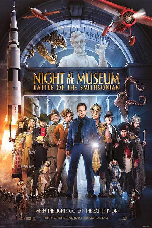
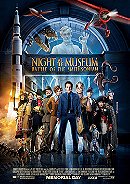
Comment : Hey, this looks like fun! Busy, but fun, full of top notch comedians playing intriguing historical characters from the past. Except, well, a couple of things really. Little Owen Wilson on his little horse is just, well, plonked there, with no reflection on the floor despite everyone else getting one, likewise for Steve Coogan, pasted on top of everyone else, and doesn’t Ben Stiller look tall these days? But the Photoshop fail of fails is Hank Azaria stamping on the space monkey’s foot. Why, Hank, why did you do it?
johanlefourbe's rating:
 787
5.7
5.8
787
5.7
5.8
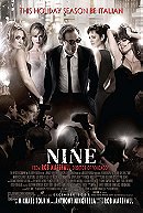
Nine (2009)
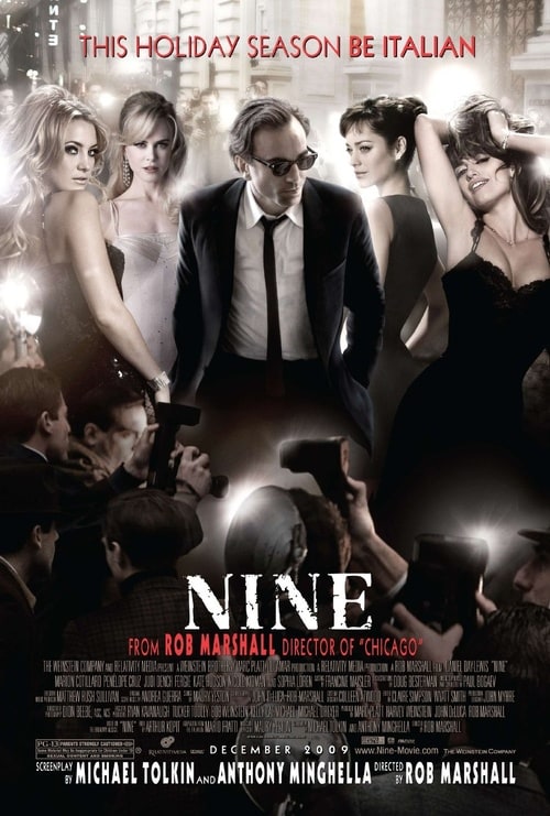
Comment : This is just a mess. There seems to be an ungodly fascination with Daniel’s crotch, so much so that paparazzi are fighting each other to take a snap of it. Then there’s the mish-mash of different bodies alongside him, odd heights, sightlines, looks, shadowing – all clumsily glued together with these flashes of light that really fail to add anything. Penelope looks the most out of place, writhing as she does while a photographer on the left hand side takes a shot of her thighs.
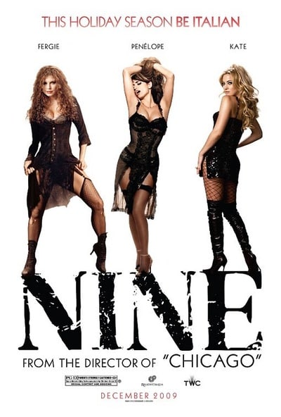
Other terrible posters :

johanlefourbe's rating:
 314
6.2
6.7
314
6.2
6.7
Nothing to Lose (1997)
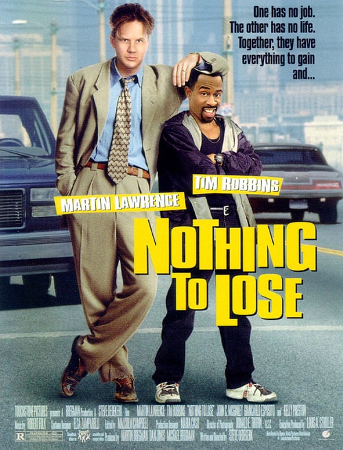
Comment : It’s true, Tim Robbins is a very tall man (6 foot 5 inches, in fact, making crawling through sewer tunnels all the harder) and Martin Lawrence is, well, a little on the small side (at 5 foot 7 inches), but those aren’t their heads, no way, no how. Robbins’s face looks like its been scrubbed with some steel wool and Lawrence’s face looks glued on.
Other terrible poster :
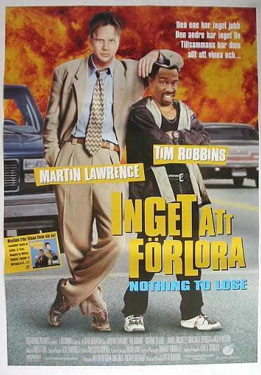
johanlefourbe's rating:
 307
5.3
5.2
307
5.3
5.2
Over Her Dead Body (2008)

Comment : Eva Longoria Parker’s picture here above the movie title raises a lot of bizarre questions. Why, for example, is one arm much longer than the other? Why does she have no wrists, knuckles, or kneecaps? Why does her necklace dangle down but not her hair? Is that the brightest cloud in the world?
Other terrible poster :
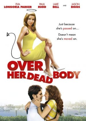
johanlefourbe's rating:
 181
4
4.5
181
4
4.5
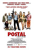
Postal (2007)
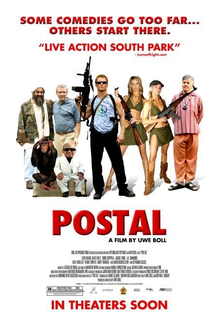
Comment : A student drama group would be embarrassed with this one. As it’s for a Uwe Boll film, and given that his superpower seems to be being immune to embarrassment, it may have gotten through unremarked. Everyone is poorly cut out and pasted in, and the shadowing stopping barely after it starts. Verne Troyer is better than this. Seriously, he is.
Other terrible poster :

 665
5.8
6.2
665
5.8
6.2
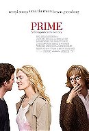
Prime (2005)
Comment : White background, cut out figures. This is not a good sign. If you take a closer look at Uma’s top and Meryl’s jacket, there’re lots of bumps and lumps from, um, well, bad Photoshop. Nice to note that Bryan Greenberg, the unknown of the three, has his face totally obscured by the angle he’s put in. But that’s by the by, really, when it comes to Meryl’s horrific sightline.
Other terrible posters :

johanlefourbe's rating:

 774
4.6
4.5
774
4.6
4.5
Sex and the City 2 (2010)
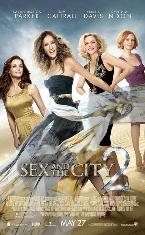
Comment : Is that… Kim Cattrall? Can it be? Can it really be? And perhaps that’s meant to be Sarah Jessica Parker, is it? There’s so much airbrushing going on everywhere in this poster, it’s difficult to point the bad Photoshop finger at any one place. Actually, no it's not: the worst victim is Kim Cattrall and her bizarrely double-elbowed left arm.
Other terrible poster :

(They photoshopped some very fake sunglasses...)
johanlefourbe's rating:
 1553
5.1
5.4
1553
5.1
5.4
Snakes on a Plane (2006)

Comment : Okay, this is not a Photoshop blunder, but we just thought we’d share. Look at the tips of the two snakes’ tails. Follow them up to the heads, and… yep, they don’t match up.
johanlefourbe's rating:
 7257
6.9
7.3
7257
6.9
7.3
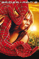
Spider-Man 2 (2004)
Comment : At first glance, this looks like a genuinely excellent poster. The golden hue, the reflection of Doc Ock, the pair of them leaping across the city. Then you wonder: “Where’s Mary-Jane’s hand coming from? Because her arm can’t be that long, can it?” Also, as it appears out of the darkness, it resembles Thing from The Addams Family crawling up Spidey’s body.
Other terrible poster :
johanlefourbe's rating:
 296
5.3
5.9
296
5.3
5.9
Spread (2009)

Comment : It looks like Ashton has been beaten about the head with a gravestone and had a blind road-digger fix his face. At first glance, it's the protruding chin, then it’s the nose, then it’s the ear, then it’s the chin again. It’s all very sad, as we’ll begrudgingly admit he’s a very handsome man.
Other terrible posters :
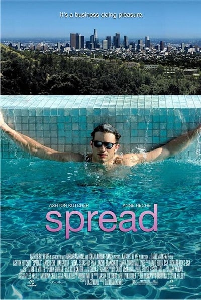
(check the sunglasses...so fake...)
johanlefourbe's rating:
 401
4.9
5.4
401
4.9
5.4
The Spy Next Door (2010)
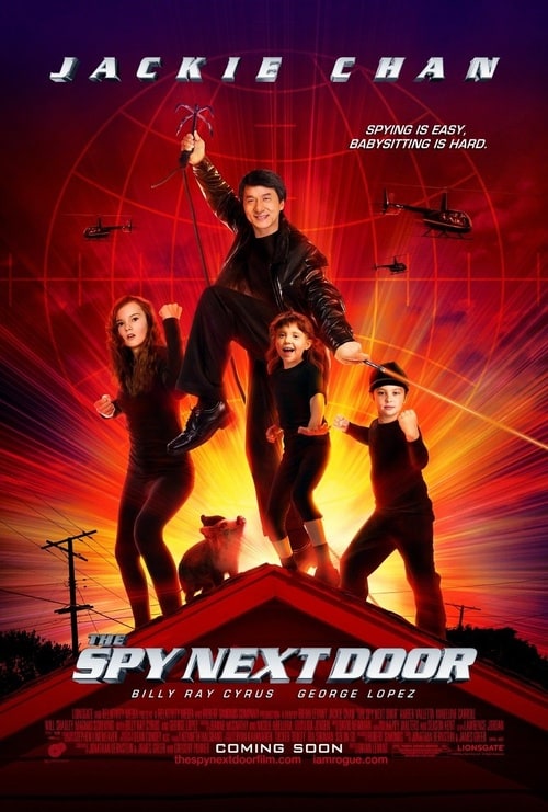
Comment : First of all, it’s trying desperately to look like another Spy Kids poster, with the streaming orange light and martial-arts-ready stances, but worse than that, far worse than that, in fact, is the grotesque bodies bad Photoshop has given the four stars. There’s no way the 5’7” Jackie Chan is that tall, and there’s no way his right leg is anywhere near that long. And if you look at his left hand, Jackie’s index finger really shouldn’t be at that angle.
johanlefourbe's rating:
 595
6.4
6.8
595
6.4
6.8
Street Kings (2008)
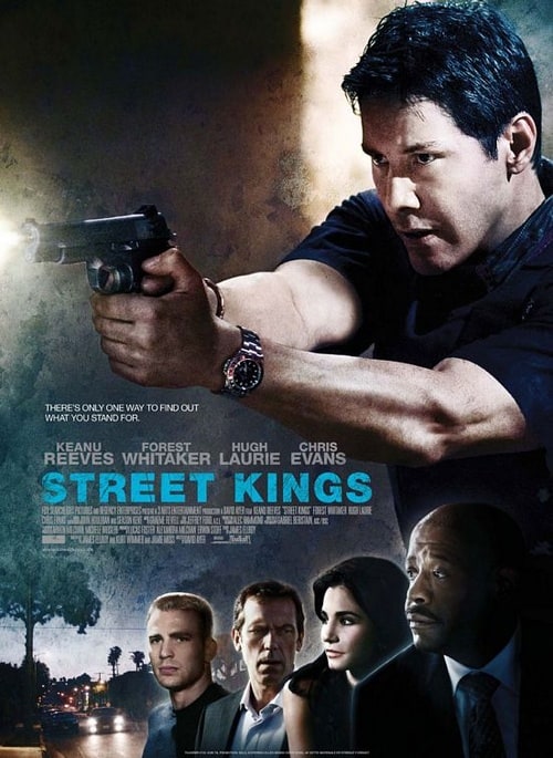
Comment : Big picture of Keanu Reeves shooting a gun, looking mean? Can’t go wrong with that. Then there are highlighted cut-out profiles of the other big names in the film below, also good, and wait, what? Where’s Keanu’s right index finger? It looks like it’s disappeared. It’s definitely not on the trigger, at any rate, so how the hell is that gun firing?
johanlefourbe's rating:
 106
1.7
1.9
106
1.7
1.9
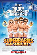
Superbabies: Baby Geniuses 2 (2004)

Comment : Four Photoshopped infants, no puppy fat, all crossed arms, all wearing stuck on shades. They’re glowing, freakishly, and their mouths all seem to be not belong to their faces, not to mention their heads not belonging to their bodies. The two on the right are the worst culprits: one screaming for some reason, the other looking, well, sleazy.
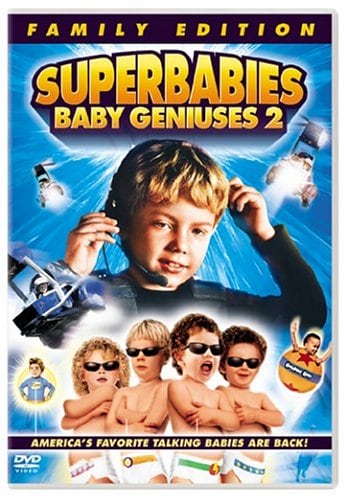
Other terrible poster :
 894
4.8
4.8
894
4.8
4.8
The Spirit (2008)
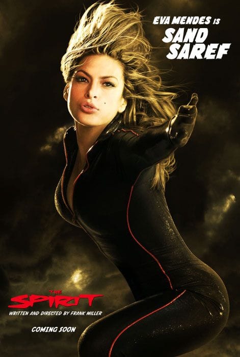
Comment : We don’t want to poke too many holes in the poster – after all, it is essentially a picture of Eva Mendes in a skin tight leather number – but if you look at her left hand, it’s all, kind of… flubbery. And though we’ll accept that her right arm might be just out of shot, behind her torso, her right leg really ought to be visible, but it ain’t. Sand Saref is just that impressive, we guess.
johanlefourbe's rating:
 344
5
5
344
5
5
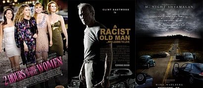
The Women (2008)
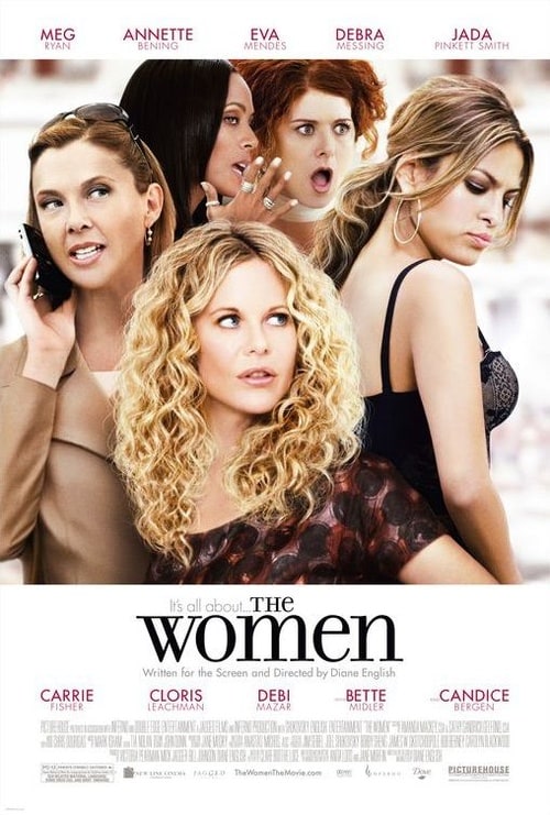
Comment : Everything, anything, all of it. Why has Meg Ryan’s face melted – and why is she so short all of a sudden? Annette Benning has been over-Photoshopped so much it’s hard to recognise her at all, and her head is left substantially bigger than anyone else’s; Debra Messing and Jada Pinkett Smith’s shared secret is so fake it may make you gag and Eva Mendes has suddenly taken a huge interest in her right breast. Not that there’s anything wrong with that, of course.
johanlefourbe's rating:
 12
4.6
3.7
12
4.6
3.7
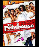
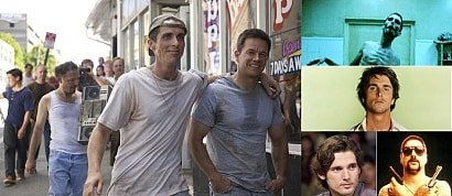
Comment : It’s safe to say that though the poster designers might want you to think they these guys are all in a bed, they definitely weren’t when their photos were taken. James DeBello on the far right, for example, his right cheek photoshopped bizarrely, was definitely not in a bed. The legs and torsos they used, maybe, but not the heads, no way. But that’s a minor quibble in what amounts to a car crash of photoshop mistakes, from the bottle of beer at the end of the bed to the sightlines that appear to be going here, there and everywhere. A how not-to guide, essentially.
Other terrible poster :
 450
6.8
7
450
6.8
7
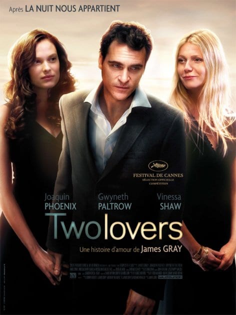
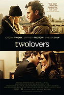
Comment : Vinessa Shaw is a very good-looking woman… so why did they do that with her face? Her forehead looks wrong – but then again, at least she’s actually looking at Joaquin (kind of), whereas Gwyneth is starting to smirk at something in the middle distance. As for the lighting, it’s all over the shop, everyone glowing in certain places, just, you know, because.
johanlefourbe's rating:
 141
5.2
4.8
141
5.2
4.8
Virgin Territory (2008)
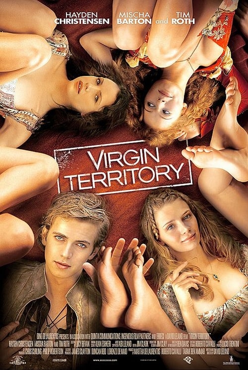
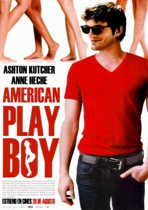
Comment : The legs! The feet! They’re attacking! And Hayden (who looks like he’s been run down by a steam roller) swats a couple away nonchalantly as he stares into nowhere. Mischa also looks a bit flat, but has fewer inquisitive feet to be dealing with, and further up, you begin to wonder whose feet are meant to be whose, if they are indeed meant to be anyone’s feet, and why they’re there at all, and, and, and… it’s all so confusing. Also, check out the lighting, which starts out strong from the right at the top of the poster, and then appears to come from the left at the bottom.
Other terrible posters :


 Add items to section
Your suggestions
 1577
5.7
5.9
1577
5.7
5.9
Comment : Again, another poster with Uma Thurman... Look at the cgi, it's just awful and the snakes are SO fake...
poster and comment provided by dan
johanlefourbe's rating:
 2806
7.8
8
2806
7.8
8
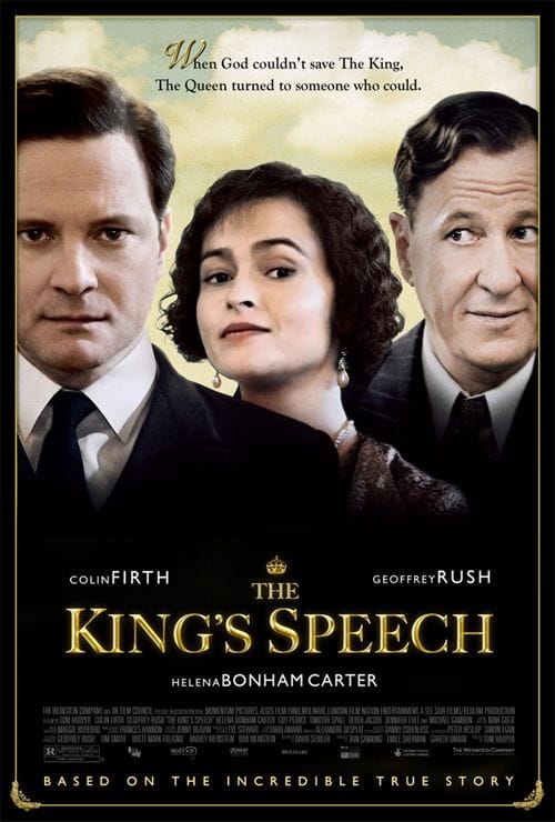
Comment : During an interview, The King's Speech own director himself, Tom Hooper, trashed this poster :
"I have to be critical of one thing about The King’s Speech that I don’t believe is doing it any favors of reaching a wide audience: This poster. I don’t like it.
Let’s just say that poster will be replaced very quickly with a very good poster.
The current one looks like a direct-to-DVD poster, not something being considered for Academy Awards. The actors look Photoshopped.
I hate it. I hate it. And it is not going to ever be on any cinema walls. It will be replaced. It’s a train smash. It’s a train smash."
Source : movieline
suggested by Max the Movie Kid
johanlefourbe's rating:
 82
5.7
5.4
82
5.7
5.4
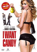
I Want Candy (2007)
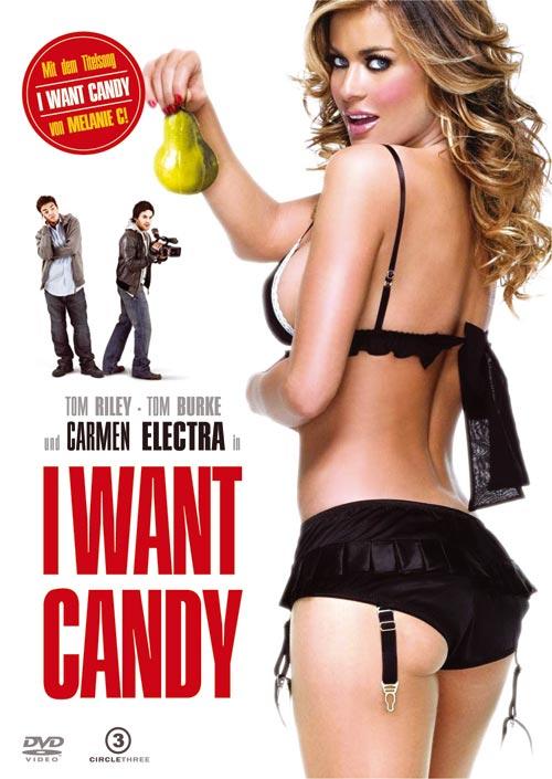
Comment : Have you ever seen a good movie starring Carmen Electra? Probably not... Have you ever seen a good movie poster with Carmen Electra? Definitely not! It displays the title which says "I want Candy" and you have Carmen Electra only wearing lingerie and holding a (very fake looking) pear... At least, with a white background, you cannot go wrong...
suggested by Isa ♥
 535
6.1
6.3
535
6.1
6.3
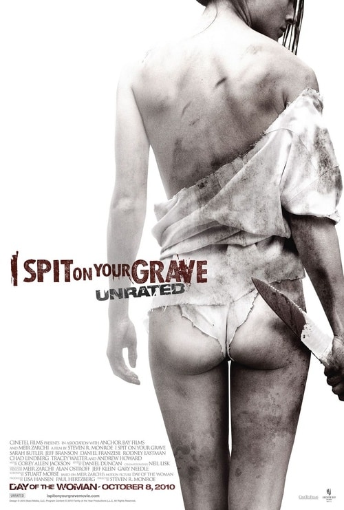
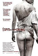
Comment : Few remakes were less necessary than last year’s unrated revisiting of the 1980 rape-fest I Spit on Your Grave, which Roger Ebert dubbed “a vile bag of garbage” that was “one of the most depressing experiences of my life.” But the film was remade anyway — with a sexually-charged poster that merged the original film’s poster “art” (see underneath) with the aesthetic finesse of a Maxim spread. Criticism was widespread and vicious, and entirely justified; the best of the rants, from Pajiba’s Dustin Rowles, fumed thus: “The only thing you can say for this poster is that it sexualizes a rape victim. And not just any rape victim, but a woman who is brutally gang raped by several men and left for dead. And they show the bruises and the dirt and the dried blood, but they make goddamn sure that they also airbush that ass. Because the assholes who put together this poster want to titillate you; they want you to see the movie, not because this woman takes revenge on her rapists, but because this hot lady with a nice ass gets gang-raped on a rock. That is the only explanation for this movie poster.” Unlike, say, the Captivity distributors, the makers of I Spit on Your Grave kept the poster out there (which, it should be noted, the MPAA was totally cool with), presumably thinking that controversy=ticket sales. Ha ha, joke was on them; the remake made less than $100,000 in its meager, 12-theater run.
Poster for the original movie:
Source : Flavorwire
suggested by johanlefourbe
 1145
6.8
7.2
1145
6.8
7.2
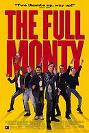
The Full Monty (1997)
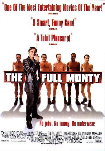
Comment : Sometimes, even good movies get bad posters. In this case, those heads do NOT belong to theses bodies. In my opinion, the beam looks even worse as it is way to straight and it is obvious none of them is actually holding it. But, as usual, with a white background, you always limit the damages...
suggested by jedidarrick
johanlefourbe's rating:
 40
5.3
0
40
5.3
0
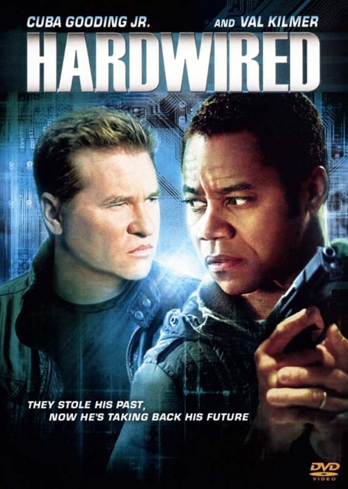
Comment : Basically, 3 things went wong here :
1. It is pretty ugly.
2. Cuba Gooding Jr. is obviously not holding this gun and those spooky hands obviously don't belong to him (what happened to his arms?!? They are gone!!!).
3. And the worst (or the best, depending your attitude towards such matters...), Val Kilmer doesn't look at all like his pic on the poster during the WHOLE freaking movie!! If you wonder how he looked like, check underneath...

suggested by johanlefourbe
johanlefourbe's rating:
 117
5.5
6
117
5.5
6
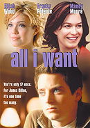
All I Want (2003)
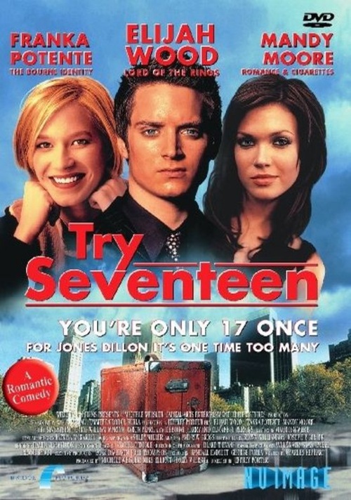
Comment : To be honest, it might not be the ugliest poster out there but what really bothered me is that they actually switched the hair color of the actresses involved... Indeed, in this movie, Franka Potente was a brunette and Mandy Moore was blond (see pics underneath) but, for some reason it was completely the other way around on this pathetic poster. Seriously, the guys who are paid to make these posters should check at least such basic details because the end-result looked just so unprofessional...
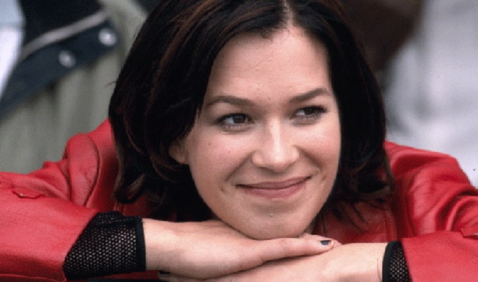
Franka Potente

Mandy Moore
suggested by johanlefourbe
johanlefourbe's rating:
Add items to section
Worst posters (TV-shows)
 2250
7.7
7.9
2250
7.7
7.9
True Blood (2008)
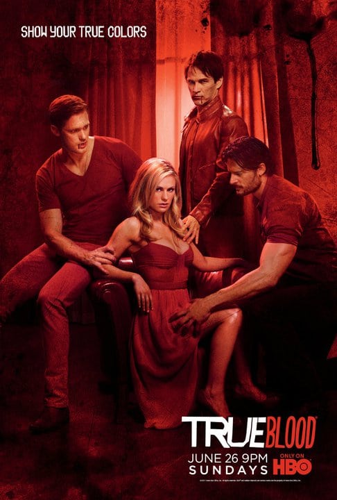
Comment : Anna's legs are waaaay too short for her body and that werewolf dude's arm is huge! Aslo why is Alexander Skarsgard staring so creepily at the werewolf! While wolfman stares at Anna's boobs! Alex's legs also seem a little too skinny...
suggested by RockerChick
These are the worst movie posters ever. Most of the time, it is because Photoshop has been very badly (ab)used. Check this out !
Added to


 RSS Feed
People who voted for this also voted for
If movies followed their original casting...
When Hiphop and Movie Collides!
"If Movie Posters Told The Truth" 2!
Actors who looks the same on every movie poster
"If Movie Posters Told The Truth"
Extreme Body Modification
Weirdest Movie Titles! Extended Edition!
Worst Movies of 2010...

Well THAT didn't happen...
Top 25 Child Performances
Oops!
When beautiful actors play real people

Comixed

5 Romantic movie gestures that's actually illegal
We're all mad here
30 days, 30 movies and 30 lists
A Movie A Year (Part 1)

The evolution of Tom Hanks

Nerds + Gorgeous chicks = ?!?@#$%?!

The evolution of... (B)

10 Memorable Movie Poster Controversies

The evolution of Dustin Hoffman