 Login
LoginNew rearrange list page

 Moderator Admin
 Tom
10 years, 1 month ago at Apr 26 3:29 -
Tom
10 years, 1 month ago at Apr 26 3:29 - A new design for rearrange list has been added please let me know what you think
 Moderator
 The O.P.
10 years, 1 month ago at Apr 26 9:29 -
The O.P.
10 years, 1 month ago at Apr 26 9:29 - 1. Haven't really tested it thoroughly yet, but I guess vertical sections are OK on a smartphone, not so good on a desktop/laptop horizontal display, or even on a tablet .
Maybe the old layout should stay when your browser says you are on a PC.
2. On a same note, the "Add Section" button is sort of "hidden" at the bottom of the page in the new vertical view.
3. Where is the Delete List button now?
4. Love the longer text under icons: two rows instead of just one. That's pretty useful when you search for a title! :)
5. Item drag&paste (to another section or to delete) seems to be finally working on a standard Android browser. You had to use Puffin before. Great!
6. All the same, I would rather keep the red delete button under each icon, just in case, as drag&paste to Delete may get clumsy on longer lists.
7. Same goes for adding a search result. Dragging it to a section may be clumsy on longer lists, and that's the only way to add it now.
 Moderator
 emberlin
10 years, 1 month ago at Apr 28 15:42 -
emberlin
10 years, 1 month ago at Apr 28 15:42 - I think it's going to be difficult to rearrange lists with a lot of sections. Because you will have to scroll now, to find the section. I liked having them all at the top.

 Anautix
10 years, 1 month ago at May 3 11:15 -
Anautix
10 years, 1 month ago at May 3 11:15 - I agree with The O.P. especially his points 6 and 7.
Moderator The O.P.
10 years, 1 month ago at May 3 13:01 - I had a hard time trying to save Section Name in Edit section. It only saved it after I clicked on "Save" a number of times, then I tried to change it but could not save it again.
Also, the "Edit" and "Delete" links are too small and too near to each other. A couple of times I was going to delete section instead of editing!
Also, the "Edit" and "Delete" links are too small and too near to each other. A couple of times I was going to delete section instead of editing!
Moderator Admin Tom
10 years ago at May 21 18:30 - 1. Haven't really tested it thoroughly yet, but I guess vertical sections are OK on a smartphone, not so good on a desktop/laptop horizontal display, or even on a tablet .
Maybe the old layout should stay when your browser says you are on a PC.
I don't really want to have 2 different versions of the rearrange page, the tab layout was fiddly and quite confusing, quite buggy sometimes and didn't work well on mobile. I think the new version has many advantages such as being able to see the entire list on one page and being able to drag to a exact point in a section. I can see though it may be worse for lists with a large number of sections and items.
2. On a same note, the "Add Section" button is sort of "hidden" at the bottom of the page in the new vertical view.
This will be changed
3. Where is the Delete List button now?
This has been added back
4. Love the longer text under icons: two rows instead of just one. That's pretty useful when you search for a title! :)
5. Item drag&paste (to another section or to delete) seems to be finally working on a standard Android browser. You had to use Puffin before. Great!
Yes it should now work on all touch devices.
6. All the same, I would rather keep the red delete button under each icon, just in case, as drag&paste to Delete may get clumsy on longer lists.
Hopefully this can be added back.
7. Same goes for adding a search result. Dragging it to a section may be clumsy on longer lists, and that's the only way to add it now.
A option has been added to collapse sections, hopefully this will help a bit
Deleted user
 Deleted
10 years ago at May 26 3:07 -
Deleted
10 years ago at May 26 3:07 - Search works worse in beta. I was trying to add this TV show to one of my lists: www.betalistal.com/tv/jerry-building-unholy-relics-nazi
Here's what it gave me when I tried to search "jerry building":
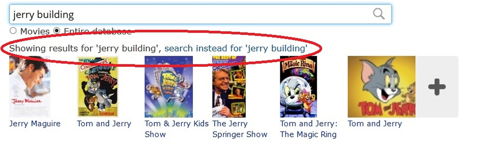
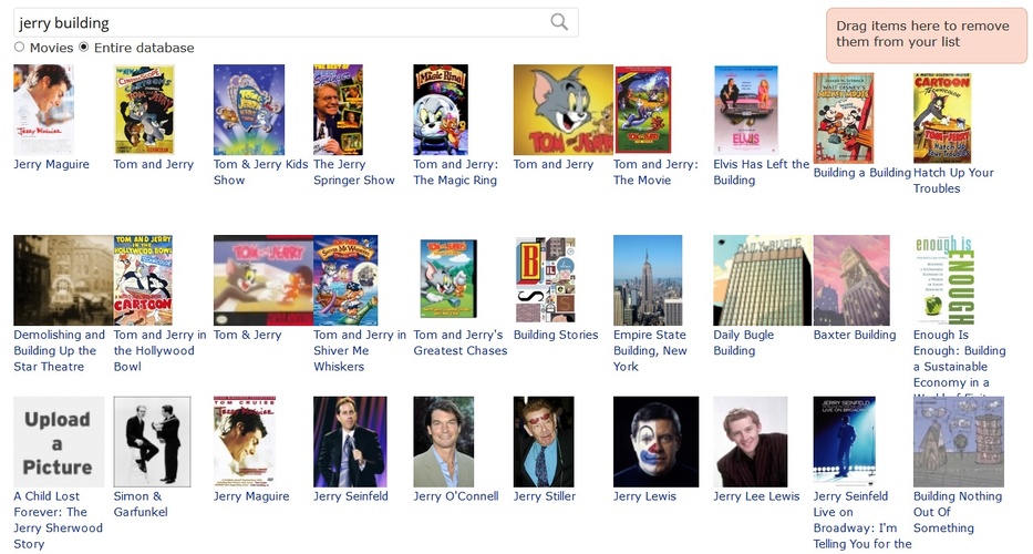
I clicked to affirm that, yes, I meant "jerry building" when I wrote "jerry building" and then it gave me this:

And as you can see from the third picture, when browsing through the results, it sure gives a whole amount of "building" and "jerry", but no "jerry building":
Also: Why isn't there a possibility to choose the default display mode of a list anymore when creating a new one? Now the display mode has to be chosen again every time when a new section is added to the list, which is clumsy if the list has many sections and the wanted display mode isn't the notes view.
I don't think this feature should be removed, especially because old Listal showed a preview of what the different default display modes look like when you created a list, so it was easy to choose from one of them without having to go through all of them by trial and error. The new users will be puzzled when they have to go through all of those different display modes on their own when looking for a suitable one.
Edit. I completely understand that Tom doesn't want to have two versions of the rearrange page, but I just wanted to say that personally I think that on PC the old sections just worked way better (even if it was sometimes buggy) and it's a bit of a shame that if the user is not using mobile, the site usability gets lower.
Now that the sections are on top of each other and they can be collapsed, it's better on mobile but for a PC user it's way more clumsier than the old, neatly packed sections, especially if there's a lot of them. It also makes editing lists containing a lot of items more difficult since now all the items are on the same page.
So it's clearly more usable for the people who like to make short lists and not for the likes of myself who rarely have under 100 items on one list. For example, I have this big list which has dozens of sections and around 500 titles and I update it from time to time. It's just hell to rearrange it on beta. It includes way too much scrolling and dragging items around: www.betalistal.com/list/my-favorite-films-year-year
I know I'm in the minority here since the sign of the times is mobile use, but it's a bit of puzzling when a site which focuses on listing makes the actual listing more difficult for some of the users.
Here's what it gave me when I tried to search "jerry building":
I clicked to affirm that, yes, I meant "jerry building" when I wrote "jerry building" and then it gave me this:
And as you can see from the third picture, when browsing through the results, it sure gives a whole amount of "building" and "jerry", but no "jerry building":
Also: Why isn't there a possibility to choose the default display mode of a list anymore when creating a new one? Now the display mode has to be chosen again every time when a new section is added to the list, which is clumsy if the list has many sections and the wanted display mode isn't the notes view.
I don't think this feature should be removed, especially because old Listal showed a preview of what the different default display modes look like when you created a list, so it was easy to choose from one of them without having to go through all of them by trial and error. The new users will be puzzled when they have to go through all of those different display modes on their own when looking for a suitable one.
Edit. I completely understand that Tom doesn't want to have two versions of the rearrange page, but I just wanted to say that personally I think that on PC the old sections just worked way better (even if it was sometimes buggy) and it's a bit of a shame that if the user is not using mobile, the site usability gets lower.
Now that the sections are on top of each other and they can be collapsed, it's better on mobile but for a PC user it's way more clumsier than the old, neatly packed sections, especially if there's a lot of them. It also makes editing lists containing a lot of items more difficult since now all the items are on the same page.
So it's clearly more usable for the people who like to make short lists and not for the likes of myself who rarely have under 100 items on one list. For example, I have this big list which has dozens of sections and around 500 titles and I update it from time to time. It's just hell to rearrange it on beta. It includes way too much scrolling and dragging items around: www.betalistal.com/list/my-favorite-films-year-year
I know I'm in the minority here since the sign of the times is mobile use, but it's a bit of puzzling when a site which focuses on listing makes the actual listing more difficult for some of the users.
Moderator The O.P.
10 years ago at May 26 8:27 - No title/links in lists of lists rearrange mode?
Besides, I did search for Fawlty, not fawlty!
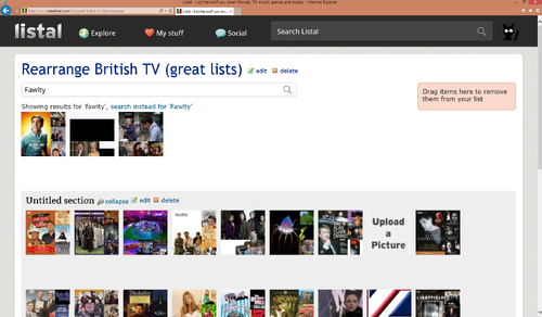
Besides, I did search for Fawlty, not fawlty!
Moderator Admin Tom
10 years ago at May 26 23:21 - The issue with searching has been fixed
That option hasn't been there for a long time, I wanted to keep the create list page simple and not have too many options, you can change the display mode by clicking edit list. After that all sections should use that mode.
Improvements are being made to the rearrange page that should help
Also: Why isn't there a possibility to choose the default display mode of a list anymore when creating a new one? Now the display mode has to be chosen again every time when a new section is added to the list, which is clumsy if the list has many sections and the wanted display mode isn't the notes view.
That option hasn't been there for a long time, I wanted to keep the create list page simple and not have too many options, you can change the display mode by clicking edit list. After that all sections should use that mode.
Now that the sections are on top of each other and they can be collapsed, it's better on mobile but for a PC user it's way more clumsier than the old, neatly packed sections, especially if there's a lot of them. It also makes editing lists containing a lot of items more difficult since now all the items are on the same page.
Improvements are being made to the rearrange page that should help
Moderator The O.P.
10 years ago at May 28 18:41 - I don't really want to have 2 different versions of the rearrange page,
I fully understand that one version is easier to maintain, but there is a risk of damaging desktop user experience while not having a satisfactory mobile experience either. If you can afford it, please consider building an m.listal.com mobile site for small vertical screens separate from the desktop version for larger horizontal screens.
Let me quote a guide about mobile optimized design:
The basic point? The desktop user interface platform differs from the mobile user interface platform in many ways, including interaction techniques, how people read, context of use, and the plain number of things that can be grasped at a glance. This inequality is symmetric: mobile users need a different design than desktop users. But, just as much, desktop users need a different design than mobile users.
www.nngroup.com/articles/mobile-site-vs-full-site/
Moderator emberlin
10 years ago at May 28 18:47 - A option has been added to collapse sections, hopefully this will help a bit
Could the sections be collapsed by default, when you open the list rearrangement?
Could the sections be collapsed by default, when you open the list rearrangement?
Moderator Admin Tom
10 years ago at May 28 18:59 - Most people recommend building responsive web sites these days (changing the design based on the browser width) , most notably google recommends it:
developers.google.com/webmasters/mobile-sites/mobile-seo/overview/select-config
Maintaining and building 2 separate sites would just be a nightmare.
developers.google.com/webmasters/mobile-sites/mobile-seo/overview/select-config
Maintaining and building 2 separate sites would just be a nightmare.
 Moderator
 SA-512
10 years ago at May 28 19:08 -
SA-512
10 years ago at May 28 19:08 - it's so aggravating to constantly have to conform
to the economics of mobile devices - numerous sites
have ruined the experience for us old time desktop
users... and here we go again - and laughingly I
once thought laptops were going to be a problem.
I despise the mobile obsession...
hopefully in a year or two you don't scale
the site to that miserable wristwatch.
Moderator Admin Tom
10 years ago at May 28 19:28 - Personally I think the new desktop site looks better than the old site but I realize these things are subjective
Moderator Admin Tom
10 years ago at May 28 19:29 - Could the sections be collapsed by default, when you open the list rearrangement?
There is going to be an option to collapse all sections and also it will remember which sections are collapsed and some other improvements.
Moderator SA-512
10 years ago at May 28 20:20 - It's not necessarily how the new site looks that's
a problem, at least for me. If I can't have the site
display content in a browser like it does right now then I
can't see using it the same way. I would certainly avoid content
filled and text rich lists as they would appear absurd in the way
I need a browser to display. Maybe just posting photos - or wait for change.
I don't have just one browser functionally open at one time - and it appears that's what the new version requires. When I mean open - I mean open - not tabbed...
Devolving to an earlier cyberspace experience is not thrilling.
To lose current functionality in favor of the tablet users is a
little depressing...
I've been using a 27 inch display for years with two browsers open sized side by side. This enable numerous websites to be open / tabbed at the same time. Very rarely is any horizontal scrolling needed with this setup. Listal has displayed nearly perfect in this arrangement. To correctly display the new Listal would mean one of the sized browsers would not be continually visible or overlapping would be occurring - a nightmarish regressive situation...
Moderator Admin Tom
10 years ago at May 29 12:12 - Try downloading a browser plugin which lets you set individual zoom levels for sites, set the zoom level to something like 80-90% and you should be able to see the full site again.
Anautix
10 years ago at May 29 14:01 - The zoom function of the browser is a dirty work around: When I reduce the zoom level to 90% the layout changes dramatically (because it's responsive), so that more content is lined up vertically and I have to scroll down even more. Further pictures lose quality when the zoom level is more or less than 100%. Couldn't you add a layout with the size of the current version of listal for resolutions of 1920x1200 or bigger?
Moderator SA-512
10 years ago at May 29 14:22 - Yeah, since I've become fairly obsessive about picture quality
this seems like a poor solution. I've also learned to avoid
as many "plug-ins" as possible. Although I really enjoy your site,
I won't be making various modifications to use it. I will still use
it for archiving purposes but can't see creating or frequenting any
text descriptive lists, polls or anything other than simple image lists.
I will cringe and avoid any situation where the right side of the screen
dumps to the bottom. If I have to modify a browser to see a list the way
it was intended then that would really be a disappointment...
Moderator Admin Tom
10 years ago at May 29 14:50 - The zoom function of the browser is a dirty work around: When I reduce the zoom level to 90% the layout changes dramatically (because it's responsive), so that more content is lined up vertically and I have to scroll down even more.
I am really confused by this since zooming the browser down should have the complete opposite effect to what you are describing
This is what I see on a maximized browser at 1920x1080 with no browser zoom or operating system wide zoom
ilarge.listal.com/image/8692817/2000full-my-profile.jpg
This is what I see on a maximized browser at 1920x1080 with browser zoom set to 90%:
ilarge.listal.com/image/8692826/2000full-my-profile.jpg
This is 2 browsers set side by side with at 1920x1080 with browser zoom set to 90%:
ilarge.listal.com/image/8692831/2000full-my-profile.jpg
If you are seeing something different please let me know which browser and operating system you are using, screen resolution and if you have any settings in the operating system to zoom/scale.
Moderator SA-512
10 years ago at May 29 15:04 - As I stated before, I should have waited for the new site to
launch - when will that be by the way? I feel I need to wait
and see if it will work for me instead of critiquing issues I
have yet to experience. If I can make it work for me then great -
if I can't I will move on along elsewhere... At this point in
time I have no desire to download patches, tweaks, plug-ins,
change operating systems, use zoom functions or basically modify
anything whatsoever simply to use a website. Not that you have
suggested most of this - just saying - this is just me.
Moderator Admin Tom
10 years ago at May 29 15:12 - Well the whole point of the beta is to fix issues before launch, the browser zoom suggestion is one option that works now but I may be able to fix these issues without the need to use that.
Anautix
10 years ago at May 29 16:22 - This is how I see the starting page at 100% zoom:
ilarge.listal.com/image/8693362/2000full-my-profile.jpg
starting page zoomed down to 90%:
ilarge.listal.com/image/8693360/2000full-my-profile.jpg
..at 90% scrolled down:
ilarge.listal.com/image/8693361/2000full-my-profile.jpg
My profile page at 100%:
ilarge.listal.com/image/8693419/2000full-my-profile.jpg
...and zoomed down to 90%:
ilarge.listal.com/image/8693422/2000full-my-profile.jpg
Zoomed at 80% all is at the right place again, but too small.
My browser is Firefox 38.0.1, Windows 7 (Zoom at 100%), Resolution 1920x1200